Note to moderator

Note to moderator:
My name is Godgift Emesi (9044) and for my A2 Coursework I am in group 3 with Monica Aghadiuno (9365), Angela Chen (9025) and Thakshana Yogeswaran (9179).
To see my work, please click on the 3 labels on the right named A2 Research and Planning, A2 Construction and A2 Evaluation, and ignore the rest as that is my classwork.

Group 3 - Music Video

Group 3 - Digipak

Group 3 - Digipak
Our Digipack, top left - back, top right - front, bottom left - inside panel, bottom right - inside panel (CD)
This is a link to our website, click the image above to enter our site

Monday 21 December 2015

Construction Post 6: Website Post Production

Initial ideas: (Website Flat Plan)
Flat Plan Webpage 1
Flat Plan Webpage 2
Flat Plan Webpage 3
Flat Plan Webpage 4
We took an equal share in editing the website. However I was primarily in charge of going through everything we'd already started creating. For example, I had to go through each webpage (e.g the individual meet the girls pages) and revamp it's layout as well as add a "Contact us" page for our record label and a "Subscribe to our mailing list" interactive feature.
In order to edit our website, we used a website called Wix.


Looking at other group artist websites, such as 'Fifth Harmony' and 'Neon Jungle' showed us the conventional key pages to have on a group artist website, which we decided to adhere to.

Fifth Harmony Website Example

Neon Jungle website example
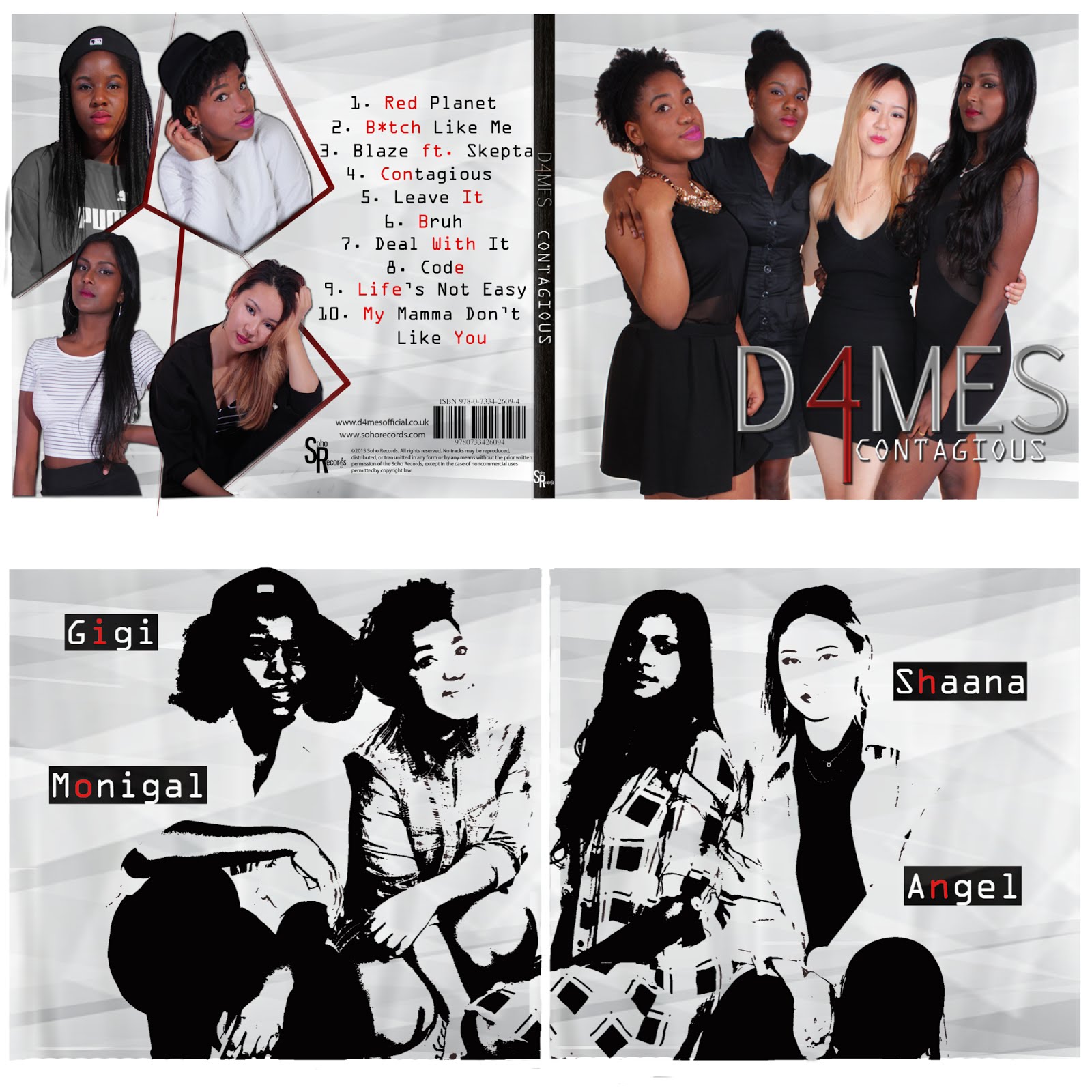
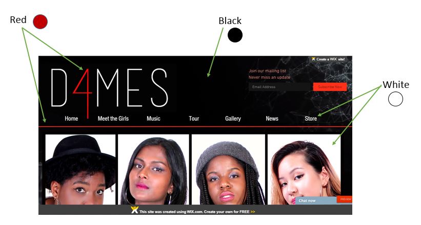
We wanted to create a synergistic brand across our music video, album cover and website so we decided that the colour scheme should be consistent through the website.
Colour scheme using homepage
As you can see from the picture above we decided to have a consistent header which contains the following:

  • A navigation bar- A user interface element which contains links to other parts of the website so the consumer can attain ease of navigation between webpages
  • Our band logo- Institutional function
  • "Subscribe to" tab- Interactivity function, offering the consumer the chance to get to be a part of the 'bands brand'
We were inspired by websites from "The Wanted" and 'Little Mix' to create an Enter Site Page before the actual homepage, which most sites usually go to first.

Little Mix 'Enter Site' first page
The Weeknd 'Enter Site' first page

Our 'Enter site' page
Our 'enter site' page has:
  • A link to go straight to watching the music video
  • A buy album sticker button which goes straight to the store for the consumer to literally buy into the bands brand, thus incensing the 'AID-Act'
  • An enter official site button which would take them straight to the main website- the hoempage


The hardest part of creating the website was probably creating the merchandise store because we literally had to individually design the merchandise as well as start from scratch in designing the t shirts, for example. 


The site we used to create the images of our merchandise
How we made our store page
We realized through previous research of websites that one of the most important conventions of a website is inter-connectivity and an important feature which helps get this through is social media links usually found either at the top or bottom of a webpage. We decided to adhere to this by having our footer packed full of our social media links as you can see below.
Our Websites Footer
Changes we made:

1)
Meet the Girls page
2) 
Header layout

Example of Tools we used:

1) Adding Images

Image &Gallery tool

Thursday 3 December 2015

Construction Post 5: Digipak post-production

The software we used to create our Digipak was Photoshop
The Digipak in the making
Angela and Thakshana
working on the Digipak
-The Green space on our digipak template was allocated only to the photo itself
-Blue was space allocated for ONLY text to spill over 
-The Red line was the 'bleed line' where anything in that area would get cut off when printing

Composing our Photoshop work space in a colour coded manner like this was an idea influenced after our teacher had advised us about the images on CD covers usually getting cut off when printed, so to have bleed lines in order to prevent this. We colour coded the bleed lines to make this easier to see. 

The creation of our Digipak was actually a very long process for us. Even though we had taken time beforehand to draw out a flat plan of it, decisions such as the right picture to use, the right backdrop to use for each panel etc. kept changing.

Stage 1: Flat Plan
Stage 2: the back cover, creating the
 red borders and inputting starry background
Stage 3:do all that is in the gif
below then input into the front cover


Stage 4: after having a group meeting 
and realizing there was no consistent
 look to our album 
Stage 5: After getting teacher feedback from our stage 3 digipak
that we couldn't leave one panel blank, we decided to make
 one picture spread across the 2 inside panels, which still
created a consistent look 
FRONT PANEL PROCESS


Front panel first/rough draft- 
(made on Microsoft word)
Shortlist of group photos excl. the one above
We realized after fitting this particular photo into the front panel template that we didn't like this particular shot due to the space in between me and Thakshana, the brick dark background not maintaining a consistent look with the starry album back cover. Also with our squatted positioning it was hard to find space to fit both our logo and album name.

Initially we had planned to use our jean outfit group photos for the front but after seeing how bad the rough draft looked we decided to quickly look up other girl group album covers who were in our genre again and we started to see some similarities between them; especially across fifth harmony, who ended inspiring the final product of our outer digipak panels.

From this small collection of bands we looked up, we realized that most of them either have a classy look to them, with dressy clothes standing in direct address to the camera, or a white/one block colour background with simple text either on top or in front of the group.
Collection of girl groups
we looked at

We decided to adhere to this convention of girl group album covers and the best shot out of our shortlist above we found to be the the all black clothing one. The outcome following this change in decision helped us formulate a colour scheme that is synergistic with our website (black, white and red) and more synonymous with the "classy street" brand we wanted our band to have.


                       A Problem we overcame                      
                                                    BACK PANEL PROCESS


Me playing around with the size
 of our jeans outfit photo for the
inside cover
Using the refine edge tool to cut
our models according to the red
border lines we create
A new skill I learnt during the editing process of the Digipak was the "Skin Smoothing effect", which is used to remove any blemishes, dark circles/ imperfections that makeup could not take care of. I was able to use a tutorial video below to help me work out how to smooth skin. I was then able to touch up all the band members faces  in all the photos used on the Digipak. 
Thakshana and I selecting the white
background away from the models 
Example of tools used: Clone stamp and Spot 
healing brush

 
Selecting away the background 
using the 'quick selection tool'
on Photoshop as shown
 on the right


INSIDE PANELS PROCESS


1st idea for inside panel

Final idea for inside Panel


Below are a few examples of some of the problems we encountered but were able to deal with:

Construction Post 4: Music Video post-production

The Program we are using to edit our video is Adobe Premiere Pro.
We wanted our music video to have a main focus on lighting, lots of fast paced editing with the use of quick cuts and transition effects. 


Adobe Premiere Pro
Me Editing
Angela editing the bridge of
our song


The Grading process

Our edit suite space


The tools which been particularly beneficial in helping us produce this concept in our music video are Pro-camp and the effects control toolbar, which enabled us to change the scale, motion, position, opacity and crop of our video. An example of these can be found below:


Procamp example
Procamp


  • Pro-camp enabled us to create a flashy effect on some clips by decreasing their brightness but increasing their contrast
  • Shaana's verse after flashy effect is
    added
  • From an audience focus group we'd interviewed after watching our music video, they commented on how much they loved the 'flashy' effects we had already minimally used, so we decided to put more in, especially in Shaana's first verse as you can see in the GIF on the right.

Cross Dissolve
Cross dissolve effect exampl
  • Cross dissolve helped us slow down the transition between clips in order to go with the slow mood of the music in the beginning of the song

Horizontal Flip

Horizontal flip example
  • Using the Horizontal flip helped us create that fast paced editing effect we wanted as a concept for the music video


Effects control bar
Effects control bar example
  • The effects control bar made it able for us to create motion within certain clips that had been filmed as a static shot. For example with this shot, we used scale and position to make a zoom in and a slight pan right

Here are a few examples of some of the problems we encountered and yet were able to solve.


My own contributions: 
  • Editing (adding effects to and cutting together clips for) the chorus scenes
  • Editing (adding effects to and cutting together clips for)  my individual verse
  • Grading
  • Cutting together clips for the bridge of the song
What I could improve on:
  • Syncing up videos to the music track properly, so the audience is tricked into thinking we are actually singing the song and is believable
  • Put more variations on the types of setups I could've included in the chorus scenes and not just restricting them to the dance shots but also the one take singing shots
Before: chorus scene restricted to
just dance shots
After feedback from teacher who 
advised us to including the random shots 
we'd filmed for fun, like the balloon scene,
 and to use them as filler shots